Context
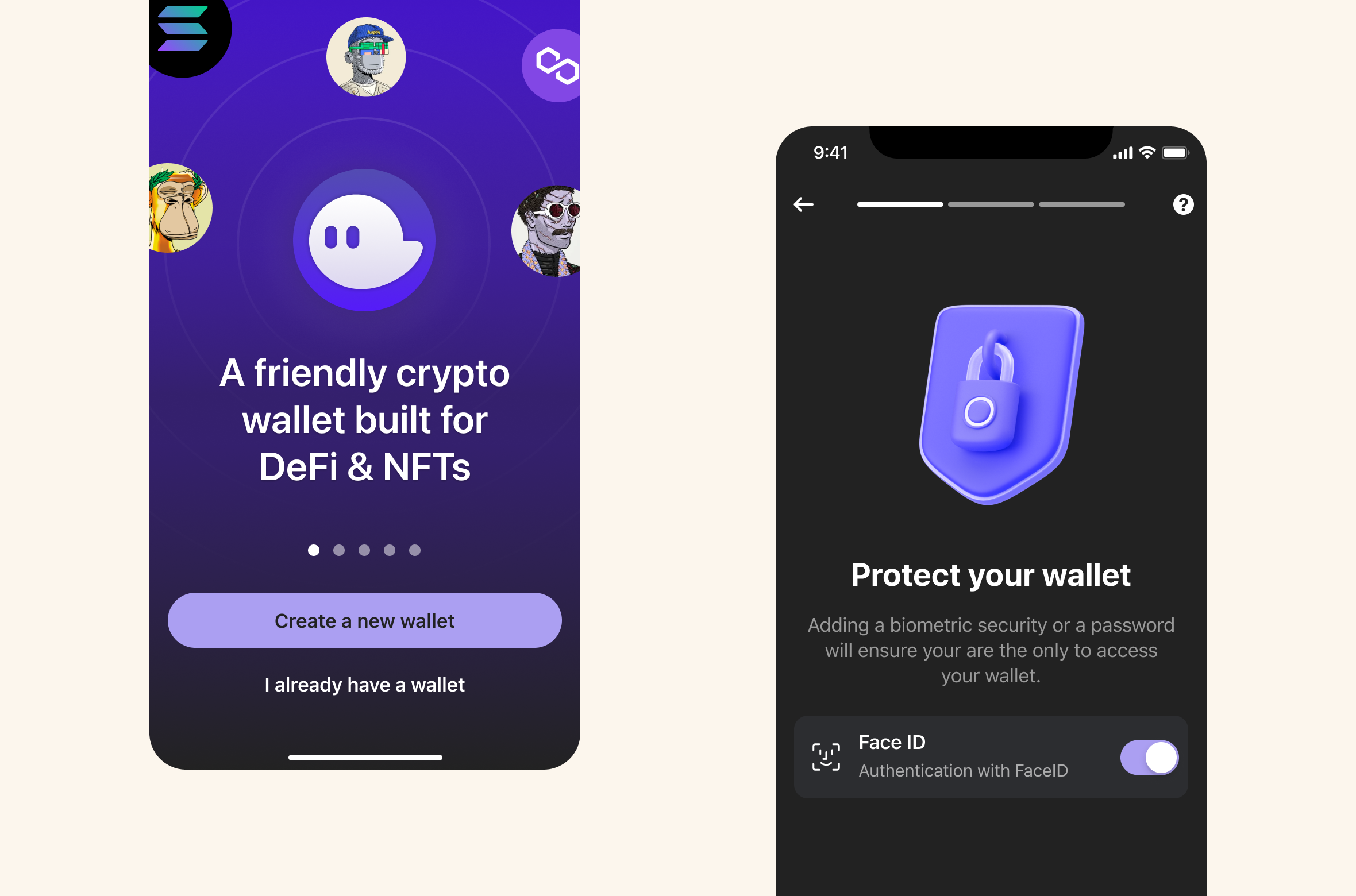
Phantom had established itself as the leading Solana wallet on desktop. As we brought the experience to iOS and Android, we needed to make the first mobile session feel useful even when a new wallet had no assets.
Outcome-first case study
Case study snapshot
The short version before the full project story.
Context
Phantom had established itself as the leading Solana wallet on desktop. As we brought the experience to iOS and Android, we needed to make the first mobile session feel useful even when a new wallet had no assets.
Key decision
The empty wallet screen was communicating absence instead of momentum. $0.00 felt like a dead end, not a starting point.
Role
I worked as Senior Product Designer on Redesigning Phantom's Empty State: Guiding New Users to First Value, shaping product decisions across iOS and Android..
The redesigned empty state became one of Phantom's highest-leverage activation screens. In an A/B test, the new experience drove a 31% lift in day-0 funding rate, reduced support tickets asking how to add money by 40%, and decreased time to first transaction from 8.2 minutes to 3.1 minutes for new users.
Phantom had established itself as the leading Solana wallet on desktop. As we brought the experience to iOS and Android, we needed to make the first mobile session feel useful even when a new wallet had no assets.
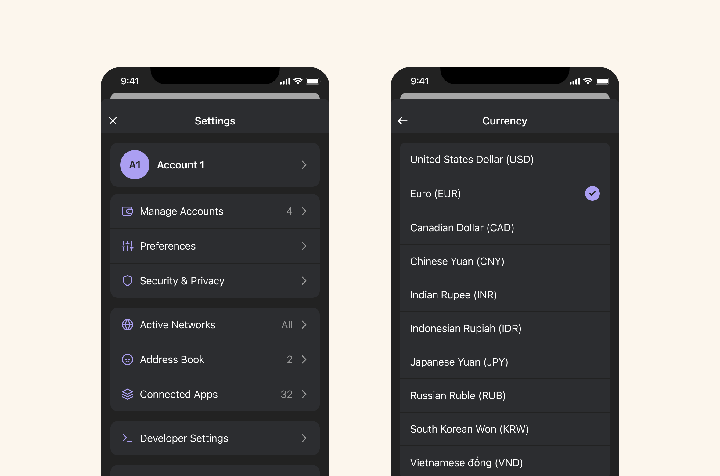
For crypto wallets, the first-run experience is brutal. New users often land on a screen showing $0.00 with no clear next step. If they do not fund their wallet in session one, retention drops sharply. Our existing empty state was passive: it showed Solana and Ethereum balances at zero but did not guide action.
iOS and Android.
The empty wallet screen was communicating absence instead of momentum. $0.00 felt like a dead end, not a starting point.
We needed to solve three linked problems:
The goal was to reduce time-to-first-fund while setting clear expectations for what Phantom helps people do next.
I led the product design work for the empty-state redesign as part of the Phantom mobile launch, partnering closely with product, engineering, and brand.
I owned the interaction model, screen hierarchy, copy direction, CTA strategy, and iteration loop across iOS and Android.
We ran five focused iterations to test hierarchy, language, and funding strategy.
| Version | Hypothesis | What changed | Learning | | --- | --- | --- | --- | | V1: "No crypto found" | Be direct about the state | Added a "No crypto found" card with a prominent "Add Funds" CTA while keeping SOL and ETH rows. | The language felt too negative. Users treated it like an error and skipped the CTA. | | V2: "Get Started" checklist | Education would beat direct action | Broke funding into three options: buy with MoonPay, buy via partners, and receive. Removed zero-balance rows. | The checklist felt like work. Without a primary action, users hesitated. | | V3: "Fund your wallet" | Provider logos would create trust | Grouped buy and receive under labeled cards and added PayPal, Coinbase, and MoonPay logos. | Logos helped, but the two cards competed for attention. | | V4: Hierarchy test | Lead with buy and keep receive secondary | Tightened the message around trusted providers and funding in minutes. | The clearer hierarchy improved taps on buy, and time-based copy reduced perceived friction. | | V5: Simplified + social proof | One message and one CTA would perform best | Returned to a single "Add Funds" CTA while keeping provider logos and supportive copy. | This was the best performer. Logos handled trust while the CTA handled direction. |
We shipped V5 as the default empty state for Phantom iOS and Android.
The final experience kept the wallet balance visible but made the next step explicit:
The screen was technically "empty," but the product job was activation. Treating $0.00 as an opportunity to educate and direct, rather than just a balance to display, helped move the metric that mattered most: funded wallets.